Hello, friends! We're so excited to have a new Annie Sloan Before + After to share with you!

One of our clients has been updating her home, and she was ready to give her red china cabinet a fresh new look to tie in with the rest of the updates and brighten up the space. We updated it with a light and airy color and finish, and we're so pleased with how it turned out!
Here's how we did it:
First, we painted the whole piece, including the shelves, with a fairly thick coat of Old White chalk paint.

After 1 coat of Old White
The "brush-y" look that the piece had after the first coat was very visually interesting and close to what we wanted the final product to look like, but we wanted to add a little dimension and depth, as well as cover the original red color. So, we mixed Old White with a hint of Coco to add a little warmth and dry-brushed the entire piece.
Then, we painted the inside of the shelf area with a coat of Coco chalk paint. When that dried, we dry brushed the entire shelf area with Honfleur.
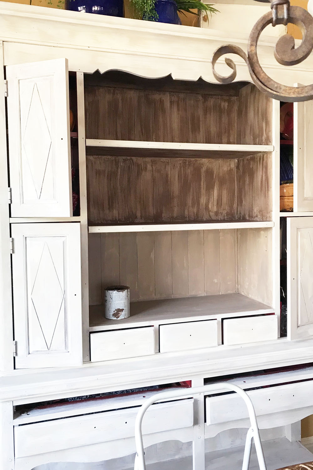
During the process of dry brushing Honfleur over the solid coat of Coco on the inner shelves.
A note about dry-brushing: go with the "grain". For example, on the shelves, we dry-brushed horizontally (left to right), but on the back wall of the shelves, we dry-brushed vertically. We try to go in the direction of our paint strokes or of "wood" so that it visually makes sense. This totally depends on the details of the piece and the look you're trying to achieve, but we feel like this is a good rule of thumb to start with.
Also, make sure to not get too much paint on your brush when dry-brushing. Having a paper plate nearby to dab some of the paint off of your brush is helpful.
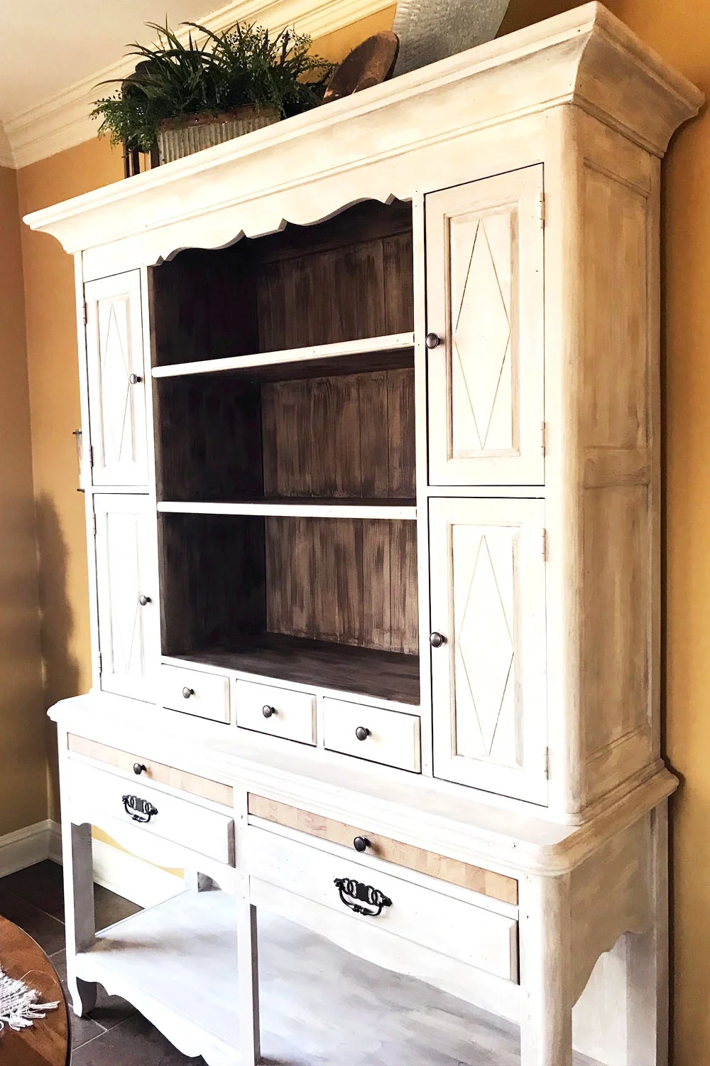
We finished the piece with Clear Wax to seal it and keep the matte finish and added a little bit of the Copper Gilding Wax to the existing hardware. Then, we styled it with a mix of our client's accessories (she had so many pretty pieces!) and a few pieces from the store.

All of the Chalk Paint and Wax we used are Annie Sloan products.
We hope this was a helpful before & after! Let us know if you'd like to see posts like this in the future!